How to Visualize Progress?
Whether it’s your annual sales target, your family budget or the data quota of your cell phone plan; modern measurement maniacs constantly need to compare their progress against some target. While some of us might have developed a sixth sense allowing us to ‘feel’ an ‘average progress’, it would certainly be helpful to have some more tangible feedback about how we’re actually doing. In this blog we’re developing a visual that helps you keeping track.
1 Problem - 2 Flavours - 1000 Fields of Application
Progress tracking problems come in two flavours and I will call them maximisation and minimisation problems in this blog. In the first case you don’t want to fall below a certain number while excess is usually a lesser problem. Examples are measures of sales, savings and anything else positive, such as tasks done etc. Minimisation, on the contrary, forces you to stay below a certain number, as is the case with your monthly data quota, your family expenses or employee turnover.
Both problems are usually measured (and targeted) periodically, e.g. yearly or monthly. While everything is unknown at the start and there are no surprises left at the end, two questions usually come up in between:
- If things continue as they have so far, will I reach my goal? with subsequent questions depending on the context and flavour;
- (If not,)What do I have to do from now on to fix this?
Before we start answering these let’s take a concrete example and assume we’re running a customer service center and have to answer at least 20 000 calls per month. This would be a ‘maximisation problem’ and we invite you to go through a minimisation example - e.g. you personal internet quota - in parallel in your mind.
The Big Picture
No matter whether min or max, we’re only talking about 1 single (real) metric - in our case the number of calls handled (per day). In addition, there is also the (monthly)target. Question number 1 can be answered by comparing strictly what is comparable, in this case the cumulative calls handled(per month) versus the target. We’re choosing a simple ‘area’ chart for displaying the cumulative figure and a flat line indicating the target. The following image series shows the evolution of this visualization:
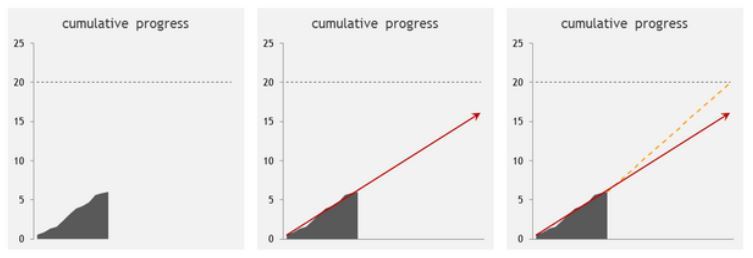
While this first version (left) already gives us some idea about how things are going, the visual gets a lot stronger as soon as we extrapolate our pace and show - or predict, if you will - where we end up at the end of the period (middle). We painted the arrow red as this scenario is certainly alarming, but would use a green one as soon as we’re ‘over target’. Technically we’re using a linear regression, but there are certainly other, maybe more appropriate options (such as extrapolating a moving target over the last n days to account more for the change in our efforts)
However this does not yet answer question 2: what figure do I have to realise from now on every day in order to hit my goal? While the answer is simple in mathematical terms - divide the difference to the target value by the remaining number of days - we want to also communicate this visually by adding add the yellow line, which basically indicates the slope the cumulative figure should follow from now on (right). While this still doesn’t answer the question, it helps clarifying the visual, especially in conjunction with the following second part.
The Pace
As we’re trying to visualize the shortfall (or surplus) with regards to a certain, necessary (daily) target pace, we chose a simple bar chart to show the actual measure, non-cumulative this time, and add a line similar to the one in the ‘Big Picture’ indicating the « target pace » for each day that we, on average, obviously missed target (left).
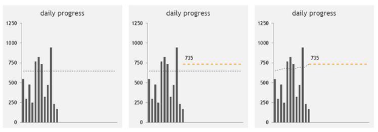
However, the tricky thing is that this target pace changes each and every day; if one day we are ‘over quota’ and do more than necessary, the next day we could drop our pace for the remainder of the period - and vice versa. We therefore chose to additionally show the « required future target pace » and apply the same colour as we did to the ‘future cumulative slope’ in the previous chart, as the two correspond (middle): in order to stay on the yellow line and reach my target, I need to keep up the yellow pace, expressed in numbers by a single, decent data label.
Showing the original and new target pace also makes very clear that we’ve fallen behind and need to catch up. But instead of showing the two static lines, we replace the original target pace by the ‘adjusted target pace’, as this beautifully demonstrates the impact of a good or bad day by lowering or raising the bar.
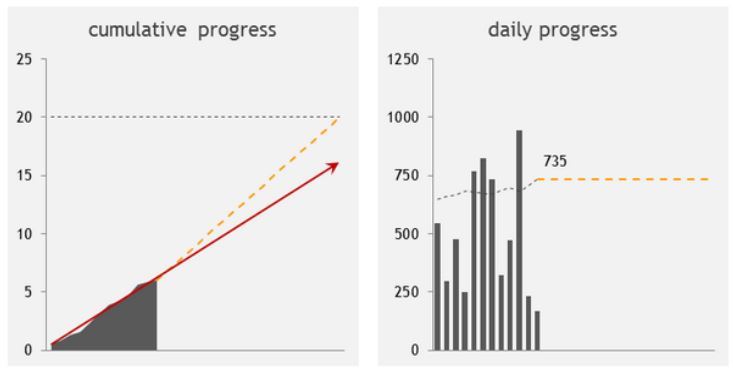
The final visualization is comprised of the two charts one next to each other. The following images show the two visualizations for a negative...
… and a positive scenario.
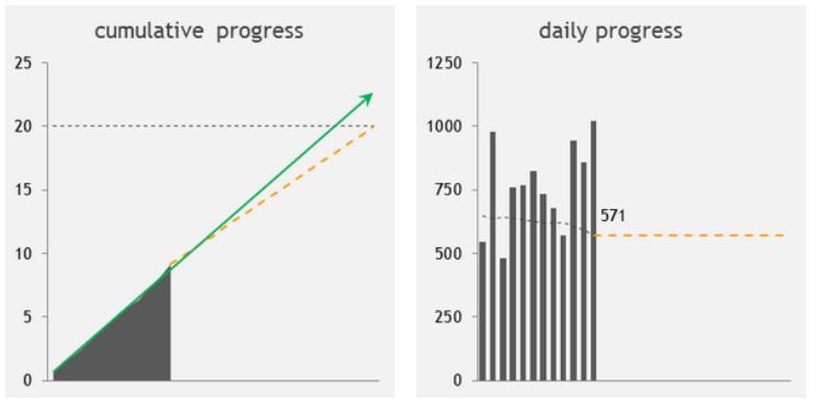
Technically, we need just one single measure as input, but in order to display the above image in, let’s say a dashboard, we need 7 data series, all of which can be calculated on the fly in the presentation layer of your backend or even in the dashboarding tool itself.
Red or Green?
Keep in mind that ‘negative’ and ‘positive’ depends on the ‘flavour’ of the problem as initially discussed. However, except for the alert color, the visualization we just developed is applicable to any situation where one needs to track the advancement towards a given goal, e.g. the mobile data quota problem you might have in mind.
If you want to learn more, you can read our blog article about dashboarding and how to construct visually effective dashboards in an agile fashion.
Other articles
Intelligence artificielle
IA en supply chain : sans données solides, pas de valeur durable
May 2026Nicolas Lepiller
Intelligence artificielle
Vertex AI et l’essor de l’intelligence agentique sur Google Cloud
April 2026Islam Touati
Business Intelligence
Migration Tableau vers Power BI : retour d’expérience et innovation avec l’IA
March 2026Adrien Chaudé et Adrien Lecellier